Hey!
Time to bring up something I come across ALL the time as a conversion optimization pro.
And that is – beating around the bush.
Avoiding the issue. Skirting it.
Inventing ways around it.
You get the picture…
It’s all too common with online stores that are doing either ‘okay’ or not too well. But let’s take a look at a store that’s definitely doing a damn sight better than ‘okay’!
Case Tesla: Demonstrate Value, Then Show Price To Match It
A little while ago, it was revealed that in the U.S. luxury automotive market Tesla has pretty much beaten the traditional luxury brands to a pulp. That’s including the German ringleaders Mercedes-Benz, BMW and Audi (much as it pains me to say it as an Audi man).
I could go into a whole spiel about the political and business ramifications behind all this, but instead let’s take a look at what’s great about their online buying experience.
Yes, BUYING experience. You thought people only browse for cars online and compare specs, then go offline to buy? Welcome to the 21st century!
FIRST, take a look at what people see first when they land on the front page:
See? ORDER is the first option, clearly. The second being TEST DRIVE, which is the closest option prior to a sale if the impulse isn’t quite there yet. They also list three other options but visually it’s clear what they want. Your ORDER.
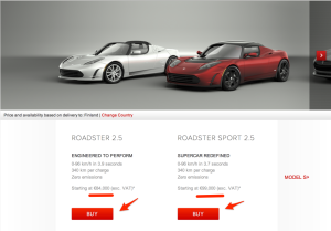
Then, let’s drill a little deeper to the product page. I decided I wanted to see what my options are with a Roadster model from Finland, and sure enough, they just shove it right in my face:
Here’s the price, a hair under one hundred big ones, and here’s the RED BUY BUTTON. 🙂 Nothing ambiguous there!
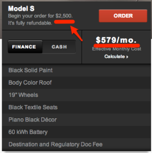
And finally, they tell you how much you have to put down now to reserve yours, and what your monthly payment might be. Plus the fire engine red ORDER button once more.
Now, you might think suuuure THEY can get away with it because they’re Tesla. They’re the exception to the rule, they have great press, a charismatic leader, geek cred, green cred, street cred… all of that good stuff.
But you would be forgetting one thing: They’ve been doing this from DAY ONE! When nobody knew who they were, why they existed, they did three things extremely well right from the start.
1. Demonstrate incredible value combined with an emotionally appealing lifestyle component (now you can have a sports car AND be green, too – making it acceptable)
2. Give people a compelling reason to buy now (waiting list, first in the market, celebrities already drive it..)
3. Order EASILY, using a clear path from here to car-in-your-driveway (put down your deposit to get in line – REALLY get in line – and here’s the date you’ll have it)
Oh, of course it helps that they’re the first electric car maker that’s designed to go big, not just a niche player.
But from a web sales guy’s perspective, it’s pretty clear: it pays to demonstrate value and channel desire, THEN be as bold and in-your-face as you can about making the sale and making it stick. They want it, now take their money. No reason to make it any more complicated than that.


No Comments
Leave a comment Cancel