In conversion optimization, the calls to action gets a lot of attention for good reason.
A lot of times they don’t even exist where there definitely should, and when they do they’re often wishy-washy.
You need to hit at least the following points to be CLEAR in what you ask of your people:
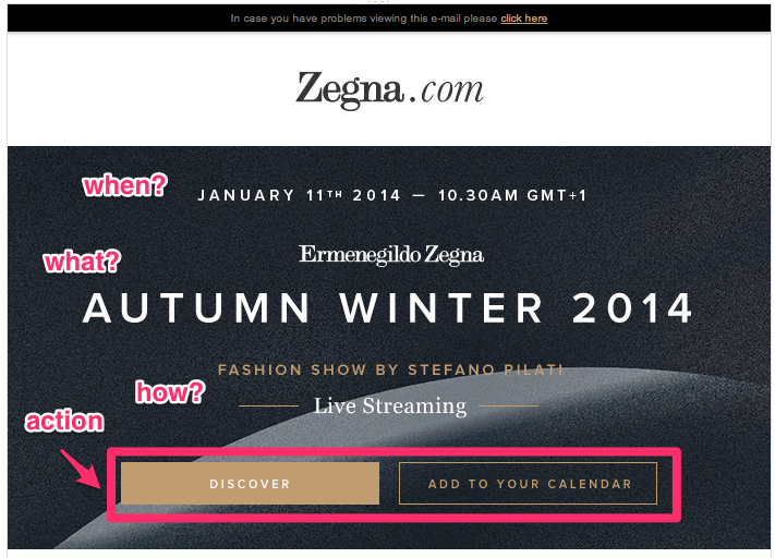
WHEN – nothing ambiguous about that, gives the universal time format for extra clarity.
WHAT – not just any webinar or live show, SPECIFICALLY tells it’s the new collection for autumn/winter 2014
HOW – it’s a live streaming event, just in case there are people who don’t know what a webinar means
ACTION – two options (just to give people choice so they won’t choke on the single-choice barrier) to either find out more or add to their calendar automatically.
Note the extremely CLEAR language throughout the ad – no need to use fancy words, let the event speak for itself. This is a form of confidence that speaks much louder than words.
It looks easy when you see it done in front of you, doesn’t it? The next time you create your Calls to Action, make sure you make them clear, non-ambiguous, and actionable. It will come across as confidence to your customers an prospects.


People reacted to this story.
Show comments Hide commentsHi Juho
I try to include clear calls to action on every site I design.
It’s sometimes hard to get this point across to customers when I’m designing their website though.
Some just want their logo as big as possible whilst others just want to fill each page with standard size text.